About Us
Services
Graphics Design Services
Crafting Visual Stories
Digital Marketing
Amplify Your Digital Presence
Ecommerce Solutions
Transform Browsers into Buyers
Website Design & Development
Unleash Creative Freedom
White Label SEO
Elevate Your Brand's Visibility
Shopify Development
Shopify Sites Crafted to Convert
WordPress Development
WP Sites Made Uniquely Yours
Content Writing
Weaving Keyword-rich Tapestries
Shopify Migration
Navigating Ecommerce Success
WordPress Maintenance
Supporting Smooth Operations
Copywriting
Words that Captivate and Convert
Software Development
Coding Your Vision to Life
Link Building
Linksmiths Driving Discovery
Server Maintenance
Smooth Sailing in the Digital Seas
PPC Management
Piloting Clicks to Conversions
Blog
Pricing
Contact Us
Menu
Close
Blog
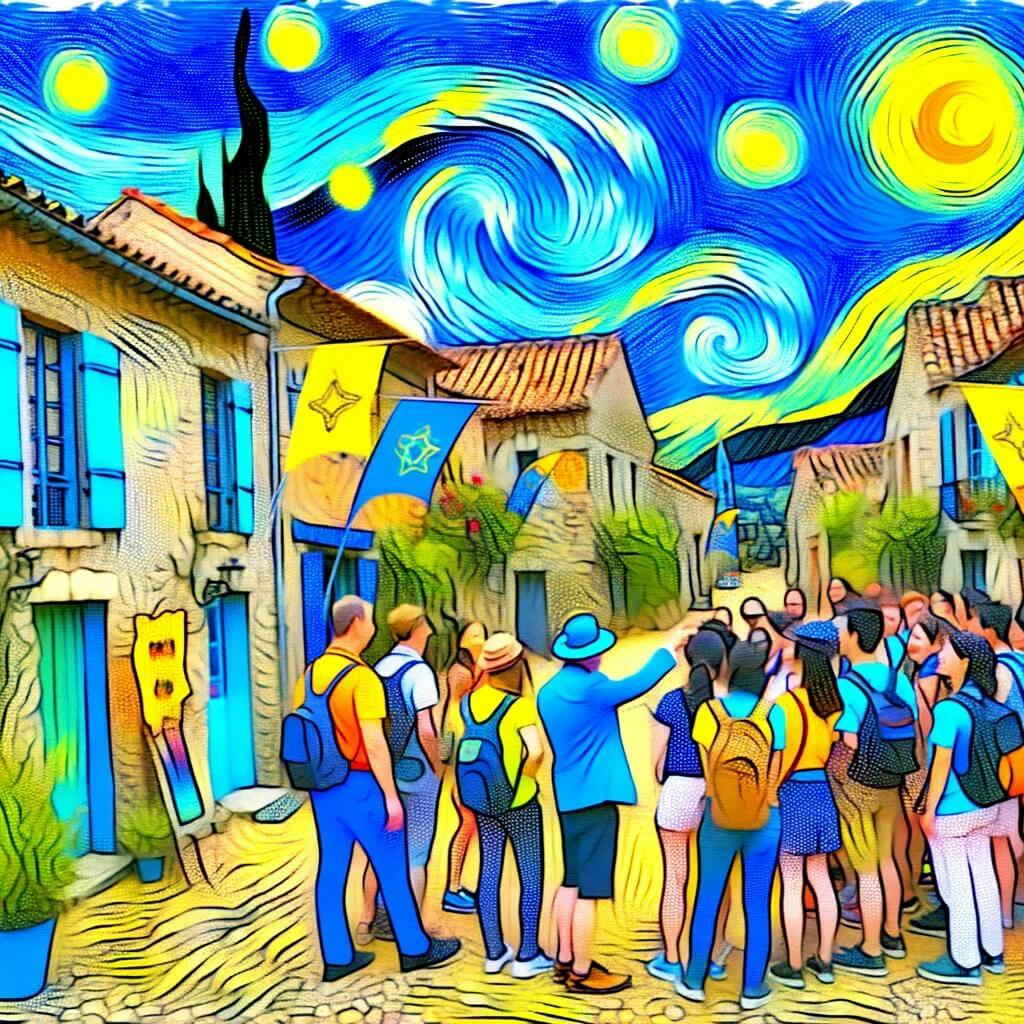
Travel
March, 15 2024
8 Essential Components of Travel Digital Marketing for Tourism Businesses in 2024
Read
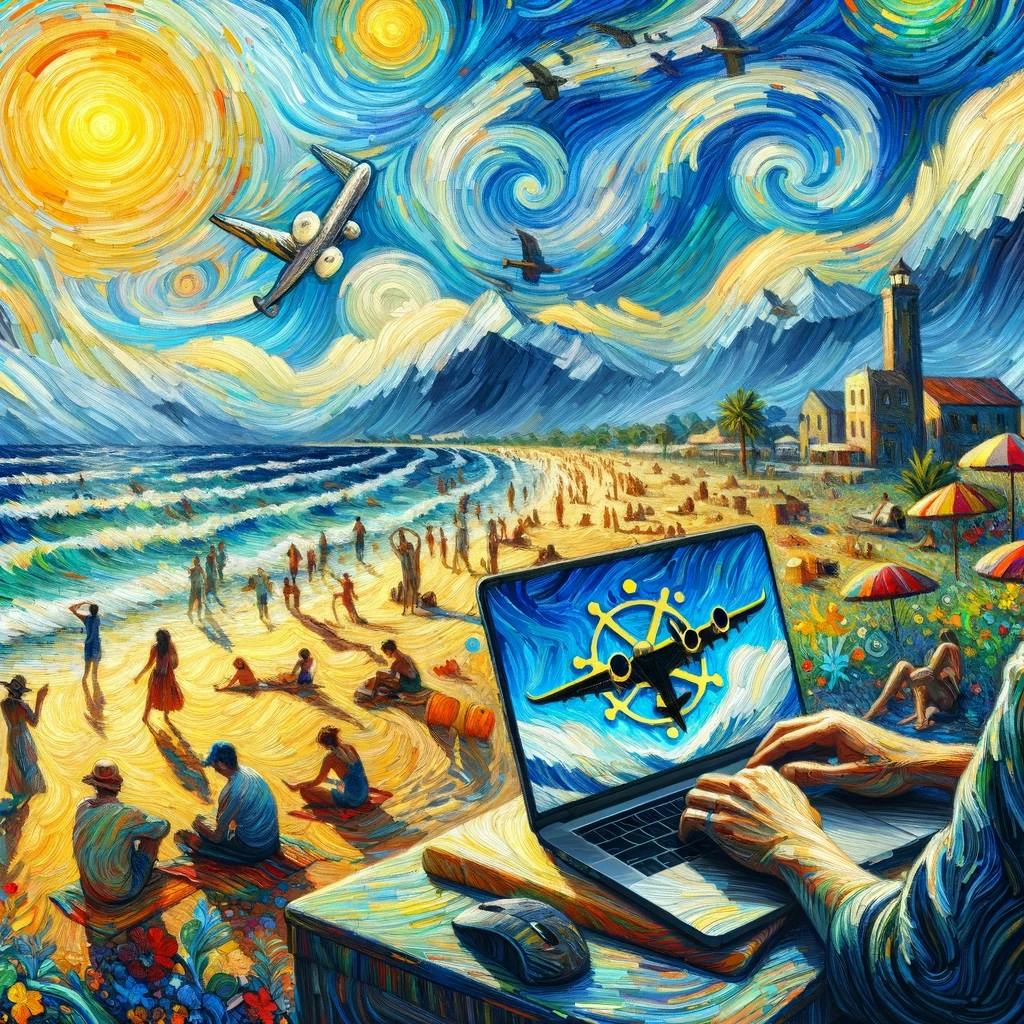
Travel
March, 14 2024
The Best Travel Marketing Campaigns: 7 Travel Advertising Ideas To Inspire You.
Read
Travel
March, 14 2024
Travel Agency Marketing Ideas: 14 Essential Strategies for the Digital Age
Read
Travel
March, 14 2024
Online Marketing for Travel Agency: Expert Strategies for 2024 and Beyond
Read
Travel
March, 11 2024
Online Destination Marketing Excellence: Key Strategies to Boost Travel Business
Read
Travel
March, 11 2024
The Ultimate Guide to Hotel Remarketing: Boost Occupancy and Revenue
Read
Travel
March, 8 2024
How to Use Digital Tourism Marketing Post-Pandemic World
Read
Travel
March, 8 2024
How to Create a Marketing Plan For Travel Agency Business
Read
Travel
March, 4 2024
10 Successful Marketing Strategies for Travel Agencies
Read
Explore more